

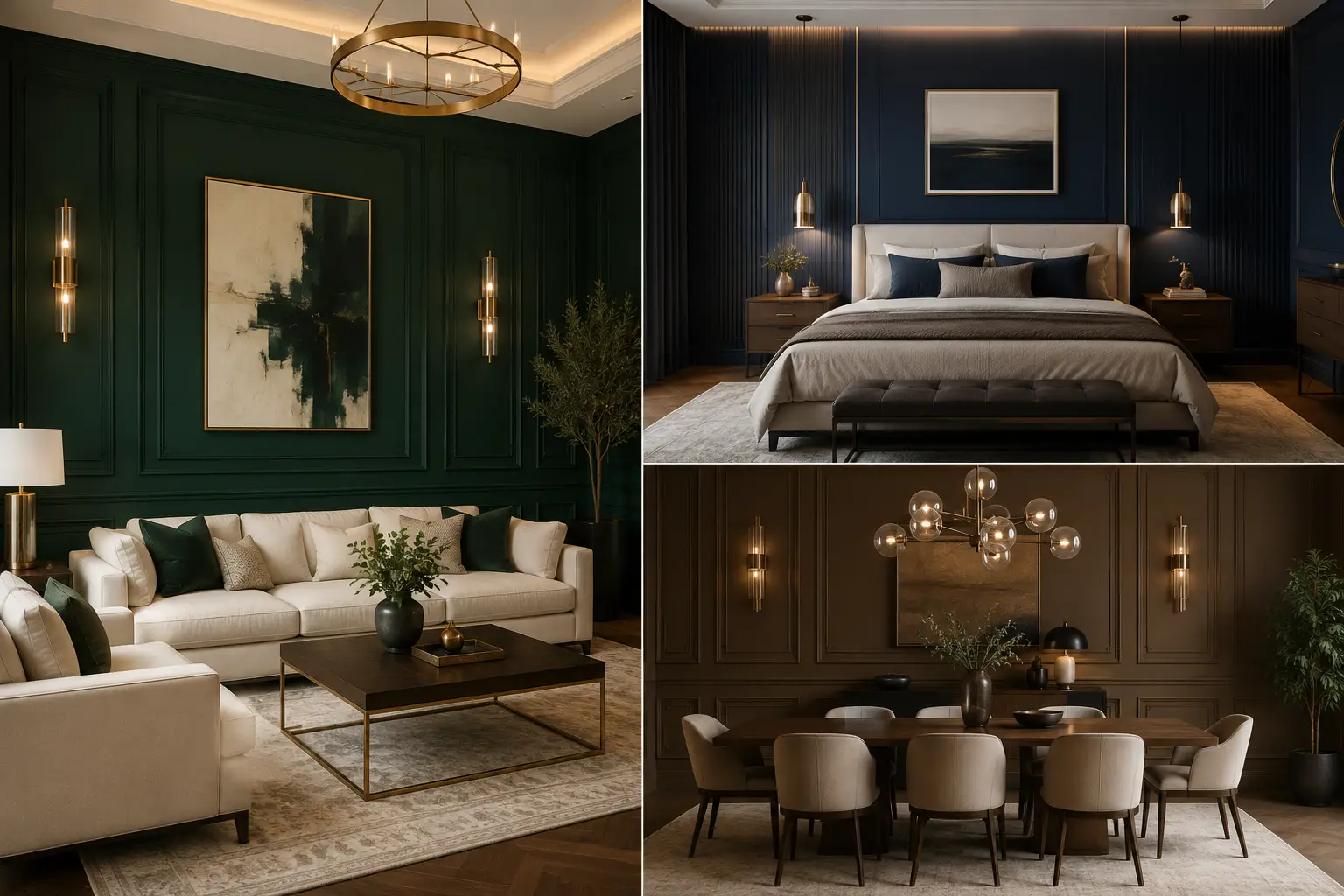
Table of Contents
The right accent wall can change the entire mood of a room. A rich, well chosen color adds depth, character, and a sense of luxury without requiring a complete redesign.
From deep emerald and midnight navy to chocolate brown and sophisticated taupe, the right shade can make ordinary walls feel far more considered. The key is choosing a color that works naturally with your furniture, lighting, and existing finishes.
Whether you’re refreshing a living room, bedroom, dining area, or home office, these accent wall colors offer plenty of inspiration. Each shade brings its own personality while creating that polished, expensive look that makes an interior feel thoughtfully designed.
Rich Wall Colors That Bring a Designer Feel
These 14 accent wall colors range from dramatic jewel tones to refined earthy neutrals. Each one can create a different atmosphere, but they all have the potential to make a space feel more elevated. Consider the room’s natural light, furniture tones, flooring, and metallic accents before choosing your favorite shade.
1. Deep Charcoal for a Sophisticated, High-End Look
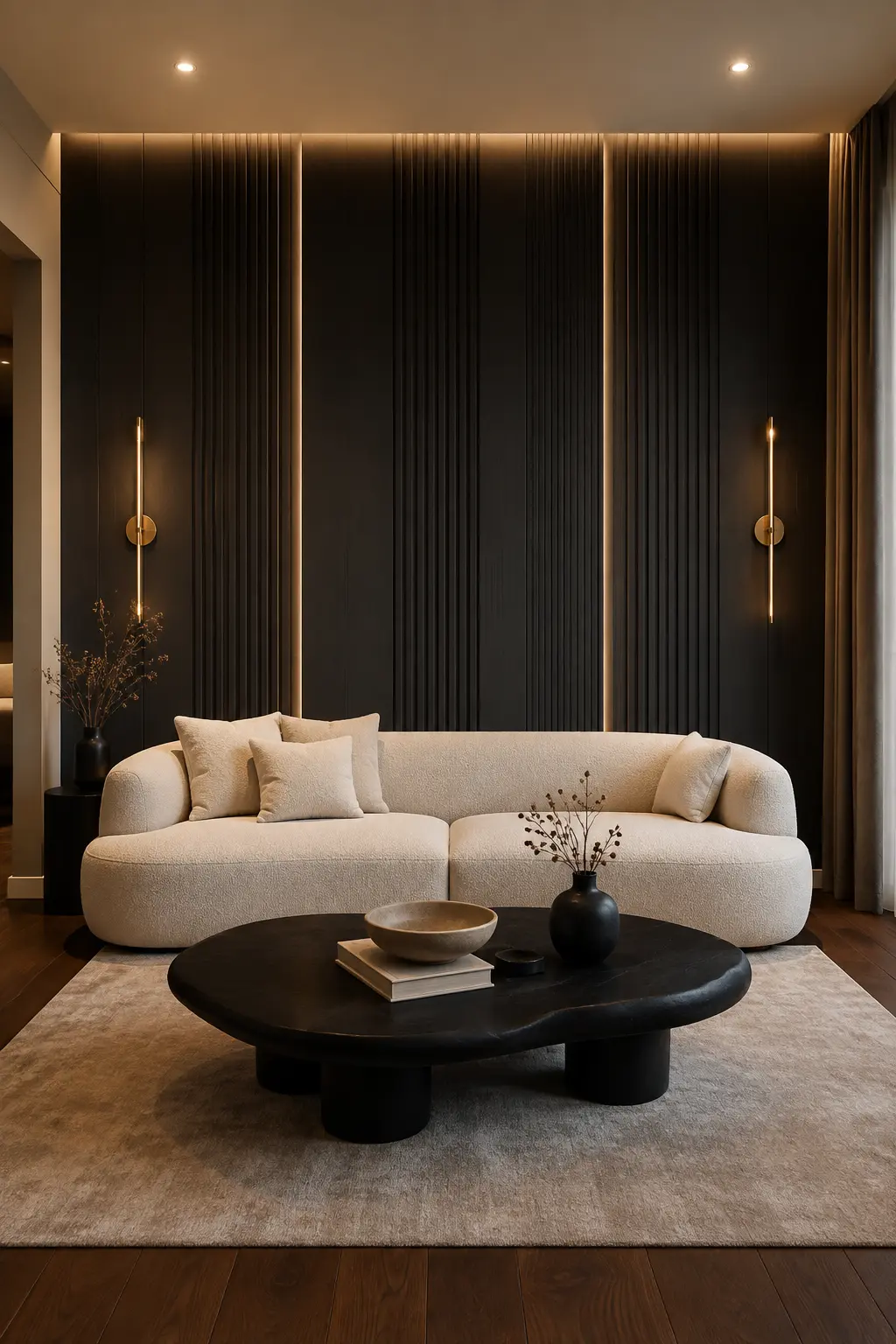
Deep charcoal is a powerful choice when you want an accent wall to feel luxurious without looking overly dramatic. Its rich, almost black tone gives the room instant depth and creates a striking backdrop for lighter furniture. As shown here, the dark wall pairs beautifully with a soft cream sofa, creating a balanced contrast that feels polished and contemporary.
The beauty of charcoal is that it works with a wide range of materials and finishes. Warm walnut flooring, black furniture, brushed brass lighting, and neutral upholstery can all complement the shade without competing for attention. Adding vertical fluted panels or other architectural detailing makes the wall even more impressive by giving the dark color dimension and visual texture.
Lighting is especially important with such a deep shade. Warm recessed lighting or slim wall sconces can highlight the architectural details and keep the wall from feeling flat. For a refined living room, combine charcoal with soft beige, ivory, and warm wood tones to create the kind of layered palette often seen in upscale interiors.
Pro Tip: Pair a deep charcoal wall with warm lighting, cream upholstery, and walnut accents to soften the darkness while keeping the room rich and sophisticated.
2. Midnight Navy for an Elegant Boutique Hotel Feel
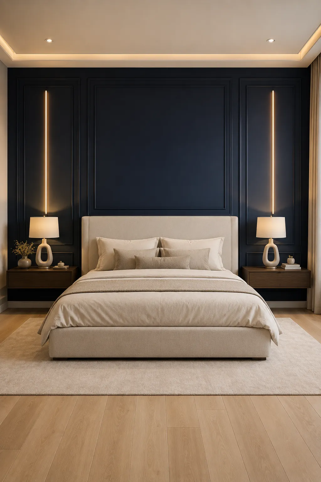
Midnight navy brings a timeless sense of elegance to an accent wall, especially when you want a room to feel refined rather than overly bold. Its deep blue tone creates a dramatic backdrop while still feeling softer than pure black. In a bedroom, it can make the space feel calm, intimate, and beautifully tailored.
This shade looks particularly polished with warm ivory, beige, natural oak, and dark walnut finishes. The contrast between the dark navy wall and light upholstered furniture makes the room feel balanced and sophisticated. Decorative wall molding can take the look a step further by adding architectural detail without requiring additional artwork or heavy decoration.
Warm lighting is the secret to keeping midnight navy inviting. Slim wall lights, concealed LED strips, or softly glowing bedside lamps can bring out the richness of the color after sunset. During the day, natural light reveals the subtle blue undertones and keeps the room from feeling too heavy.
Pro Tip: Combine midnight navy with ivory upholstery, warm wood, and soft golden lighting for an elegant bedroom that feels like a luxury boutique hotel.
3. Deep Teal for a Dramatic and Refined Living Space
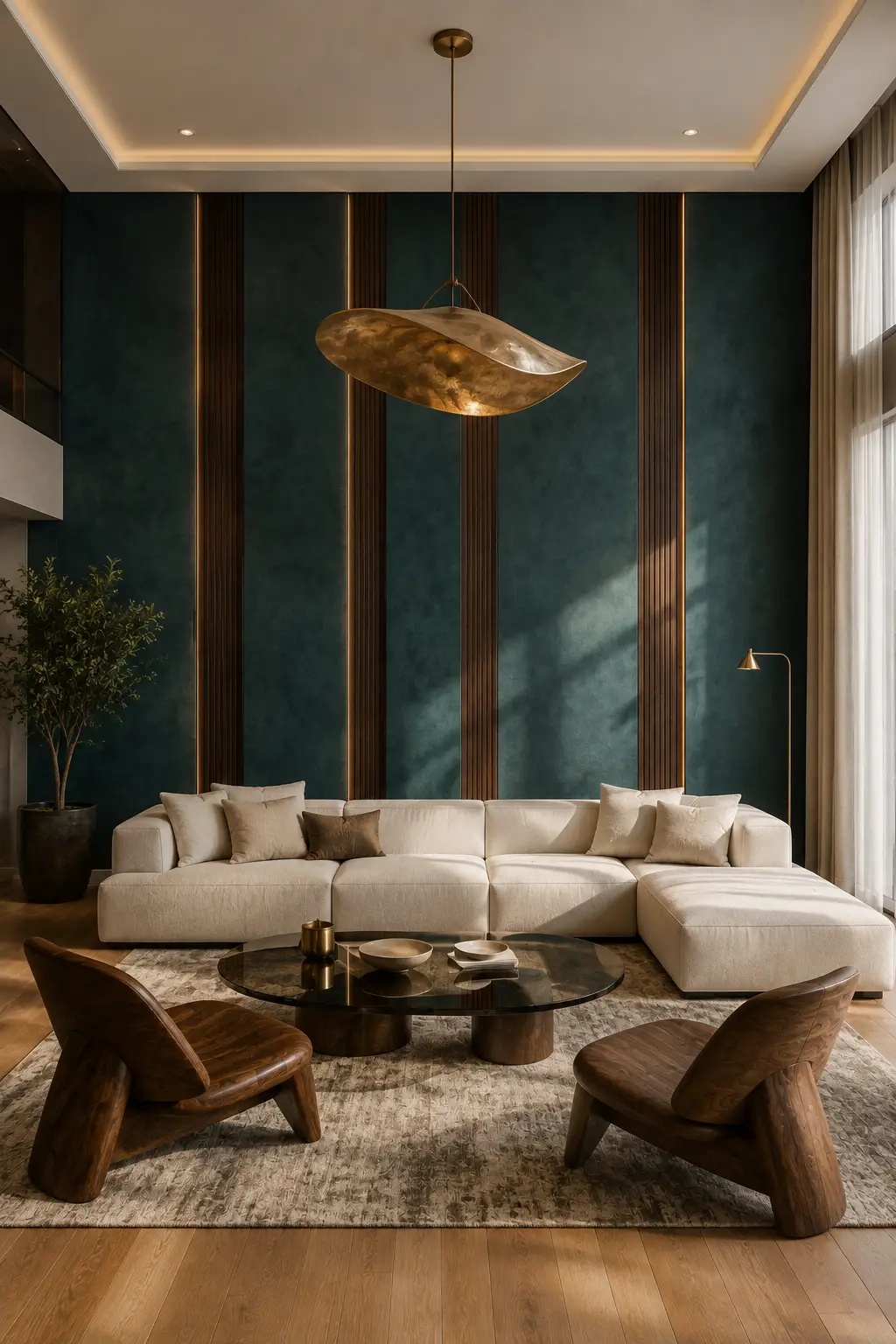
Deep teal brings together the richness of blue and the natural depth of green, making it an excellent choice for a statement accent wall. This shade feels bold without becoming harsh, especially when paired with soft neutral furniture. In a spacious living room, a deep teal backdrop can create a dramatic focal point while still maintaining a sophisticated atmosphere.
The color becomes even more luxurious when combined with warm walnut, dark wood, and aged brass details. Vertical wood slats can add structure to the wall while narrow warm LED strips highlight the contrast between the teal surface and natural timber. Cream upholstery is another strong pairing because it keeps the overall palette balanced and lets the wall remain the star.
Natural daylight can bring out the green undertones of deep teal, while warm evening lighting gives it a darker, moodier appearance. For a polished result, keep the surrounding decor restrained and let a statement chandelier, sculptural coffee table, or carefully chosen artwork provide the finishing touches without competing with the wall.
Pro Tip: Pair deep teal with cream upholstery, walnut wood, and warm brass lighting to create a dramatic accent wall that feels sophisticated rather than overpowering.
4. Deep Plum for a Dramatic Dining Room Statement
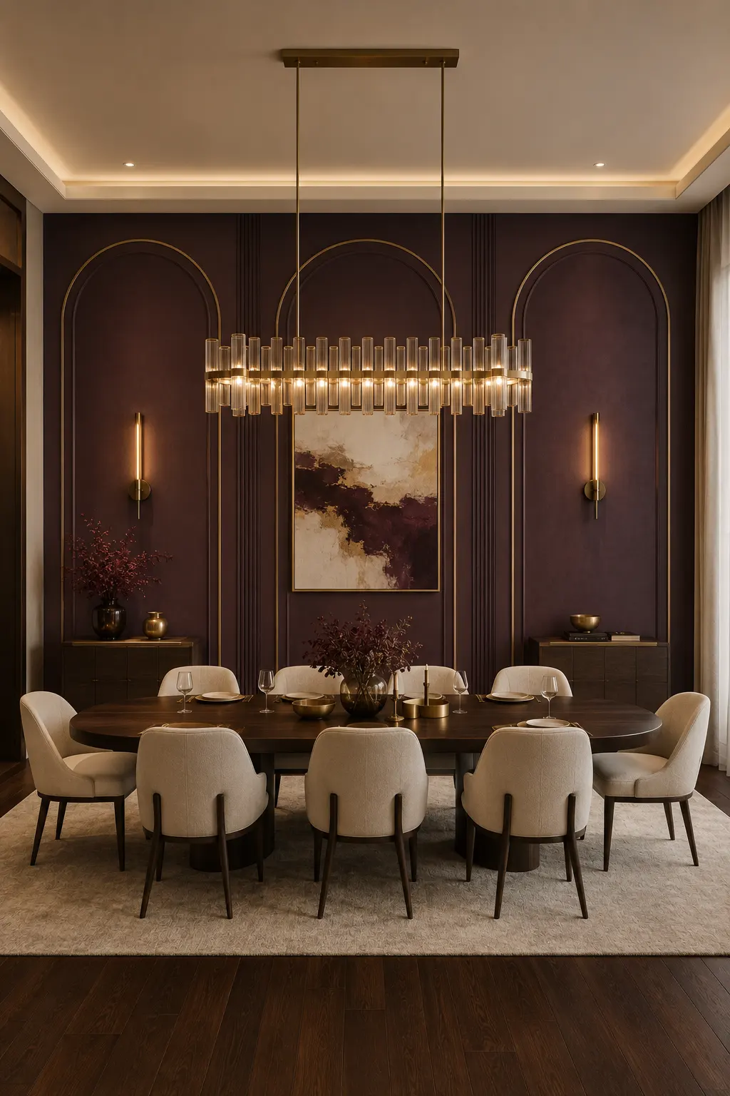
Deep plum brings a sense of richness and sophistication that works especially well in formal dining spaces. Its dark berry undertones create a dramatic backdrop without feeling as severe as black or charcoal. Used across a full feature wall, the color gives the room a layered, intimate quality that feels especially luxurious under warm evening lighting.
This shade pairs beautifully with cream upholstery, dark walnut furniture, antique brass, and warm neutral flooring. In this setting, the plum wall is enhanced by elegant arched detailing and slim vertical molding, giving the surface an architectural quality rather than leaving it as a simple painted backdrop. A large chandelier can then add another layer of warmth and visual drama.
Because deep plum is naturally bold, the surrounding palette should stay controlled. Soft ivory dining chairs, dark wood, and restrained metallic accents allow the wall to remain the focal point without making the room feel busy. During the evening, warm lighting brings out the deeper red and brown undertones, creating a rich atmosphere for entertaining.
Pro Tip: Use deep plum with cream seating, dark walnut, and antique brass accents to create a dining room that feels intimate, elegant, and exceptionally polished.
5. Deep Olive Green for a Quietly Luxurious Interior
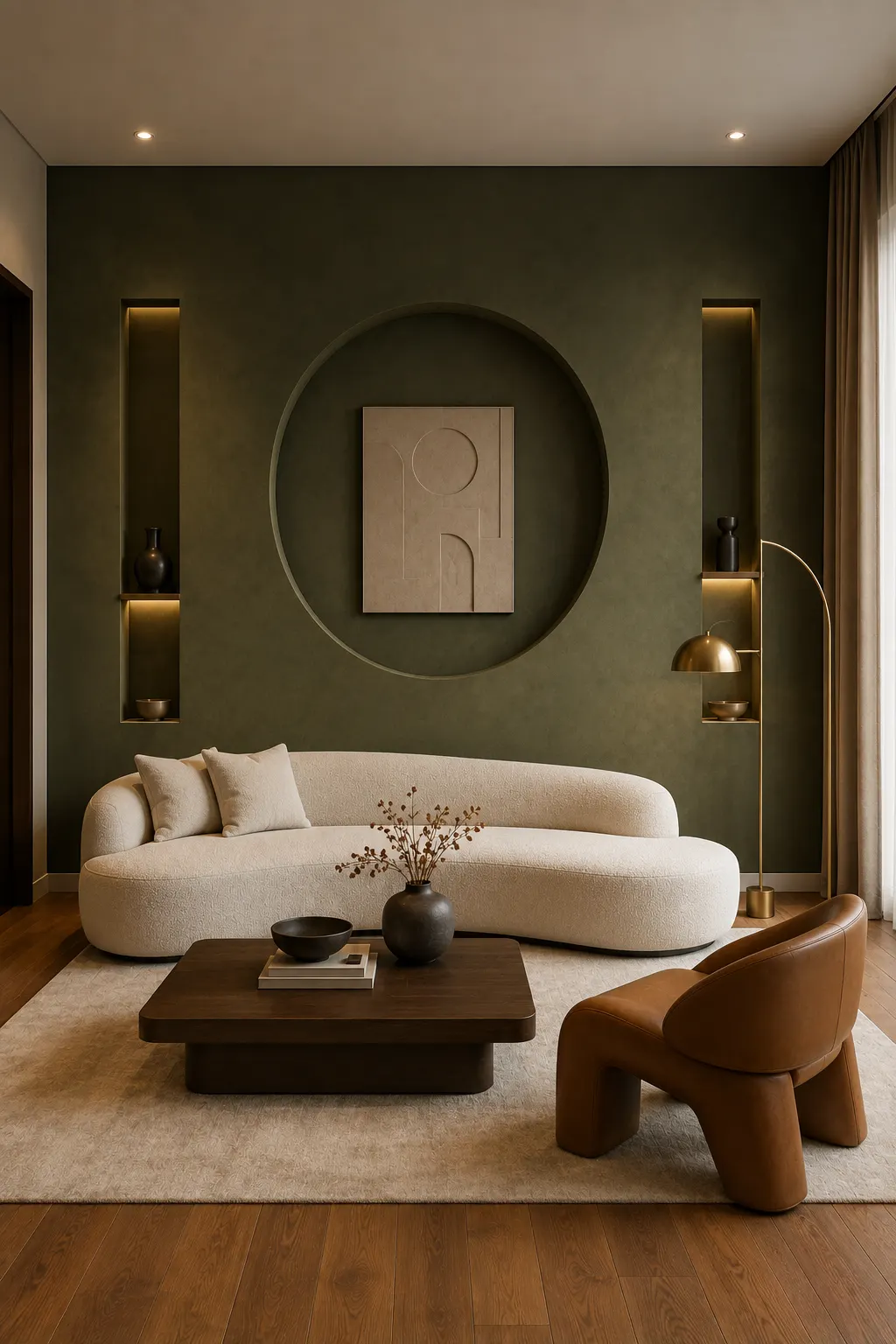
Deep olive green brings a softer kind of luxury to an accent wall, combining earthy depth with a refined, designer feel. Unlike brighter greens, this muted shade feels calm and sophisticated, making it especially effective in living rooms where you want the wall to create character without dominating the entire space.
The color works beautifully with warm ivory upholstery, walnut furniture, caramel leather, and aged brass details. A textured olive finish can add even more depth, while architectural features such as a large recessed arch or built-in display niches can turn the wall into a genuine focal point. Keeping the surrounding furniture simple allows the rich color and wall detailing to take center stage.
Lighting can dramatically change how olive green appears throughout the day. Natural daylight reveals its softer green and earthy undertones, while warm lamps bring out deeper brown and golden notes in the evening. For a polished look, combine the wall with warm wood flooring and a restrained neutral rug.
Pro Tip: Pair deep olive green with cream, walnut, caramel leather, and warm brass to create a sophisticated palette that feels expensive without looking overly formal.
6. Warm Taupe for a Soft and Sophisticated Bedroom
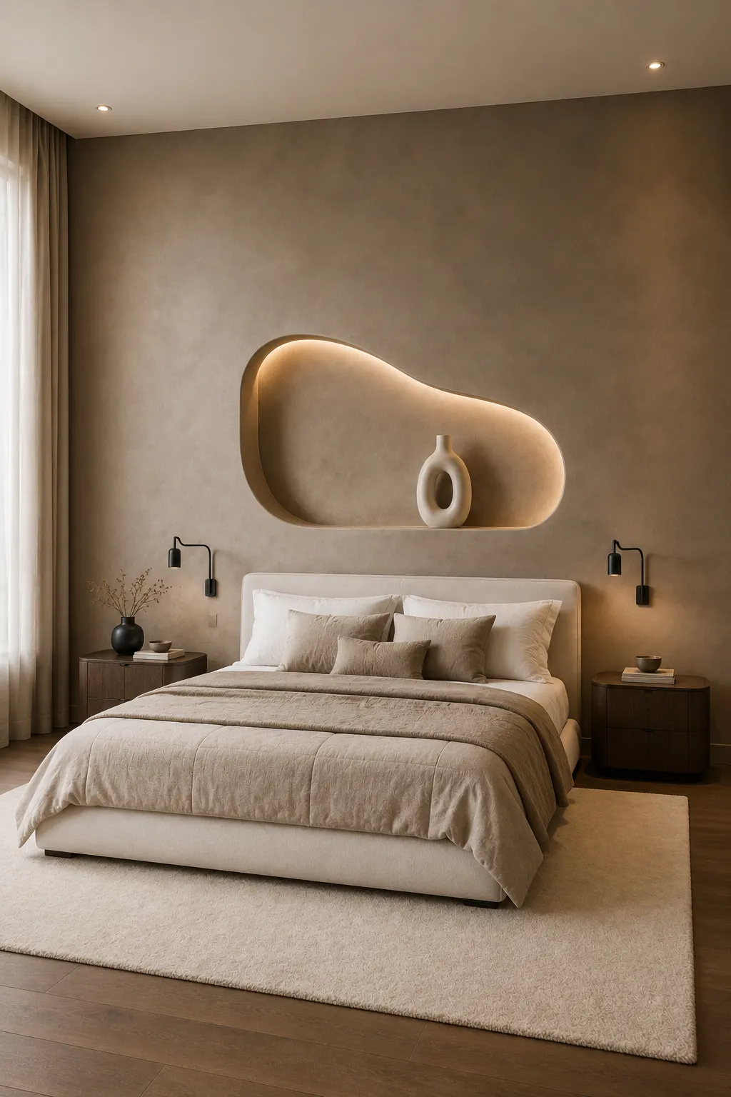
Warm taupe is a beautiful choice when you want an accent wall to feel luxurious without relying on a dark or dramatic color. Its balanced mix of beige and brown creates a warm, enveloping backdrop that makes a bedroom feel calm and polished. The softly textured finish shown here adds another layer of depth, keeping the neutral shade from looking flat or ordinary.
This color works naturally with ivory bedding, cream upholstery, dark walnut furniture, and subtle black accents. A sculptural recessed wall feature can make the taupe surface feel much more custom, especially when it includes concealed warm lighting. The result is a layered neutral scheme that feels sophisticated while remaining easy to live with.
Warm taupe also responds beautifully to changing light throughout the day. Natural daylight keeps the wall soft and airy, while evening illumination brings out its warmer brown undertones. Keep the rest of the room within a similar neutral family, then introduce texture through bedding, rugs, curtains, and upholstered furniture for a more elevated finish.
Pro Tip: Choose a warm taupe with brown undertones and layer it with ivory, walnut, and soft ambient lighting for a calm bedroom that feels quietly luxurious.
Also Read: 15 Small Home Office Ideas That Instantly Boost Focus
7. Rich Terracotta for a Warm and Sophisticated Statement
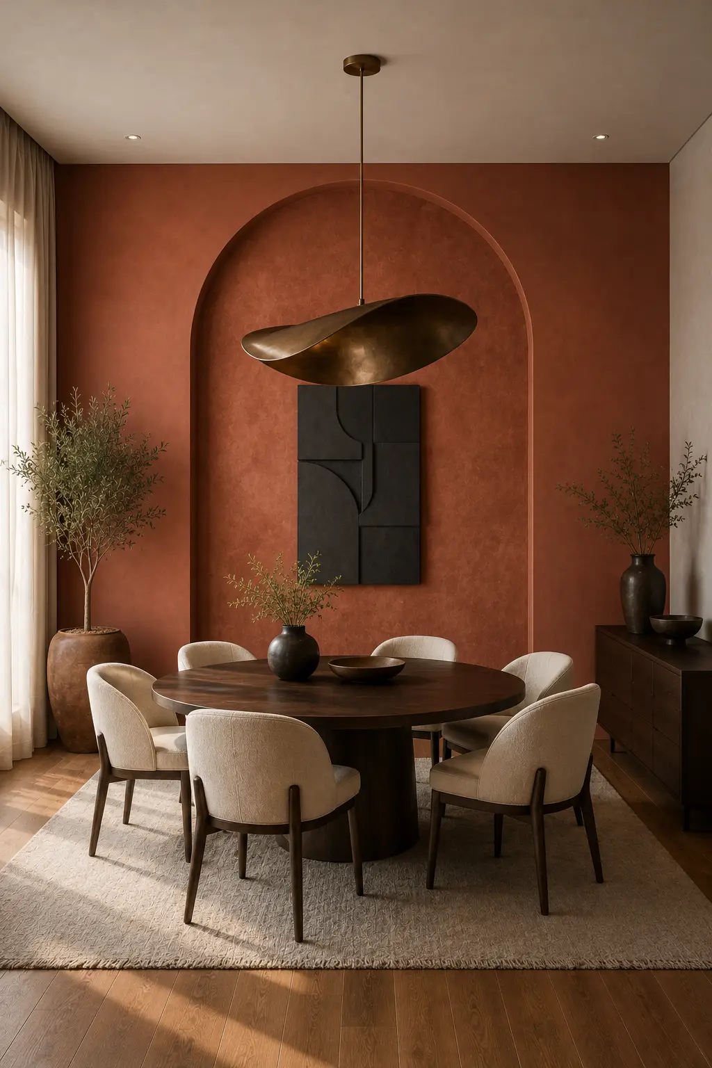
Rich terracotta adds warmth, character, and a distinctive designer feel to an accent wall. Unlike brighter orange shades, a muted terracotta with deeper brown undertones feels sophisticated and grounded. It can transform a dining room into a welcoming focal point while giving the space a sense of warmth that works beautifully in both daylight and evening settings.
This color looks especially elegant with ivory upholstery, dark walnut furniture, aged brass, and warm wood flooring. An oversized architectural arch can make the wall feel more custom and intentional, while a sculptural pendant light adds another layer of visual interest. Keeping the artwork and accessories restrained allows the terracotta finish to remain the main feature.
Natural daylight brings out the softer earthy qualities of this shade, while warm evening lighting makes it appear richer and more dramatic. For a cohesive interior, repeat small touches of terracotta through ceramics, artwork, cushions, or decorative objects without matching everything too closely. This creates a layered palette that feels collected rather than overly coordinated.
Pro Tip: Pair rich terracotta with ivory seating, walnut wood, and aged brass to create a warm accent wall that feels refined, inviting, and distinctly luxurious.
8. Deep Emerald Green for a Classic and Elevated Dining Room
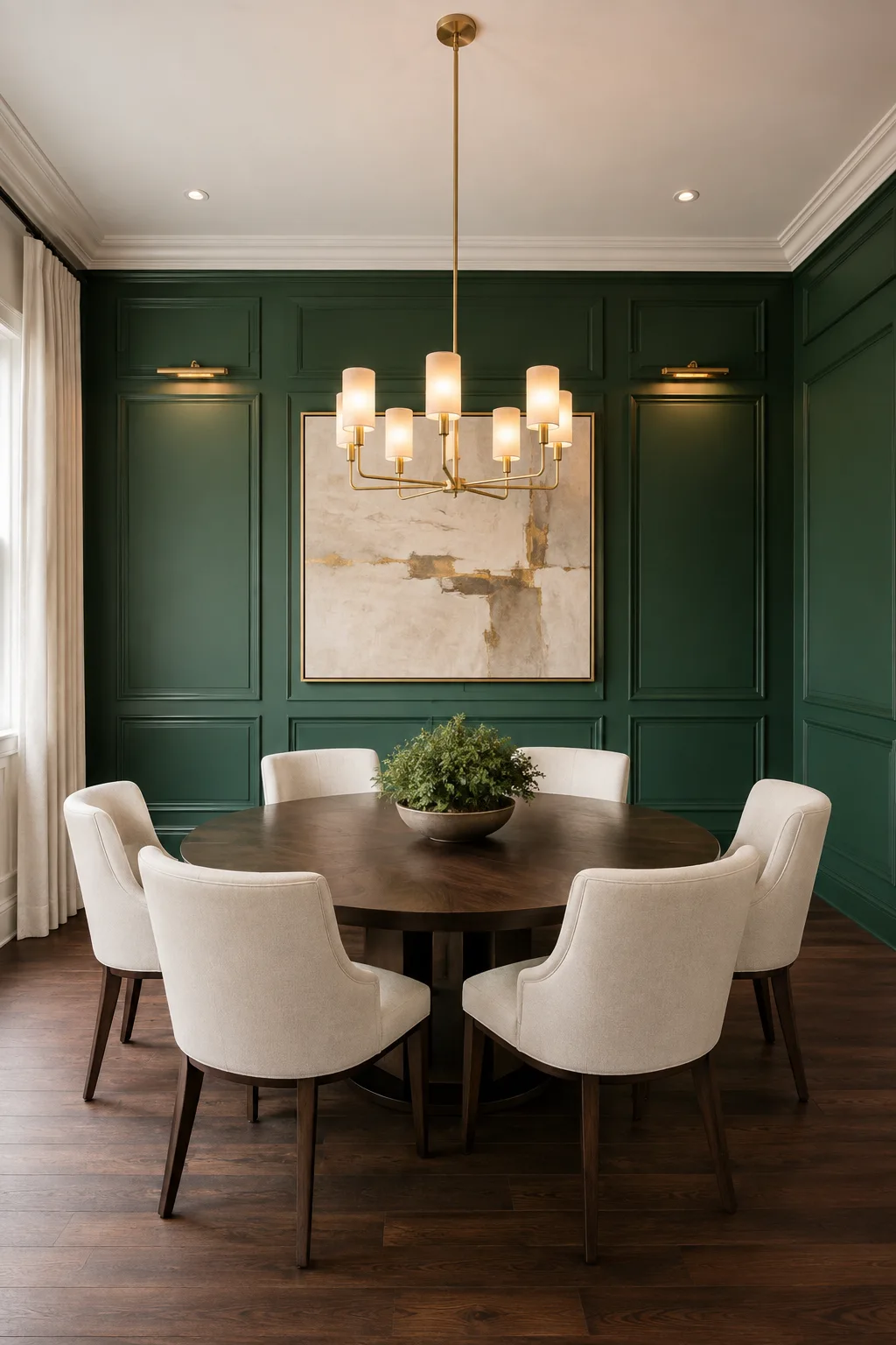
Deep emerald green has a timeless richness that can make a dining room feel instantly more elegant. Its jewel-like depth creates a strong visual backdrop while still feeling sophisticated and welcoming. Covering the wall in the same shade as the architectural molding creates a seamless, custom look that feels much more expensive than a simple painted feature wall.
Emerald green pairs beautifully with warm ivory, dark walnut, brass, and soft cream tones. In this dining room, the detailed panel molding adds structure to the rich green surface, while the large neutral artwork keeps the wall from feeling too heavy. A warm brass chandelier then adds just enough contrast to bring out the luxurious character of the color.
Lighting can make emerald green shift beautifully throughout the day. Natural daylight gives it a softer, more vibrant appearance, while warm evening lights deepen the color and create a more intimate atmosphere. For a polished result, keep the furniture relatively simple and let the wall, lighting, and rich wood tones provide most of the visual impact.
Pro Tip: Paint the wall molding and the main wall in the same deep emerald shade for a seamless designer finish, then add ivory seating and warm brass lighting for contrast.
9. Chocolate Brown for a Rich and Intimate Living Room
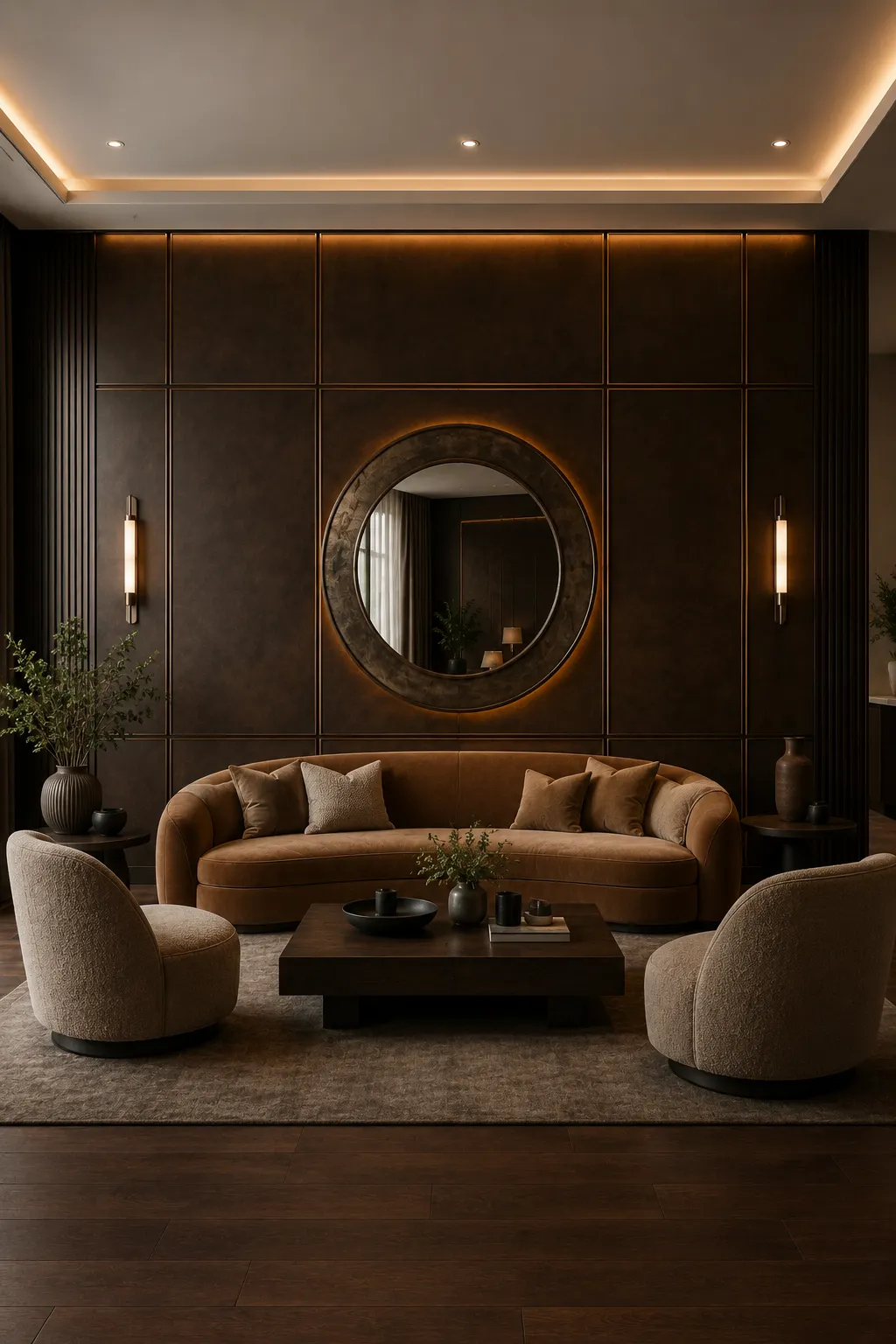
Chocolate brown creates an instantly warm and sophisticated atmosphere, making it a strong choice for a luxury accent wall. Its deep earthy tone feels especially inviting in a living room, where it can create a cozy backdrop without sacrificing elegance. When paired with warm lighting and rich upholstery, the color takes on a refined boutique-hotel character.
The shade works beautifully with caramel leather, beige boucle, dark walnut, and aged bronze details. In this design, the large rectangular wall panels give the brown surface a structured architectural look, while the oversized round mirror creates a striking focal point. Soft lighting around the mirror and along the ceiling adds depth, allowing the wall to feel layered rather than flat.
Chocolate brown is particularly effective when the rest of the room stays within a warm neutral palette. Cream, taupe, caramel, and natural wood tones help balance its depth while keeping the overall look cohesive. For an even more luxurious result, use a combination of matte surfaces, textured fabrics, and subtle metallic details rather than introducing too many contrasting colors.
Pro Tip: Layer chocolate brown with caramel leather, cream upholstery, walnut, and warm bronze lighting to create a cozy living room that feels rich and exceptionally polished.
10. Slate Blue for a Polished and Contemporary Living Room
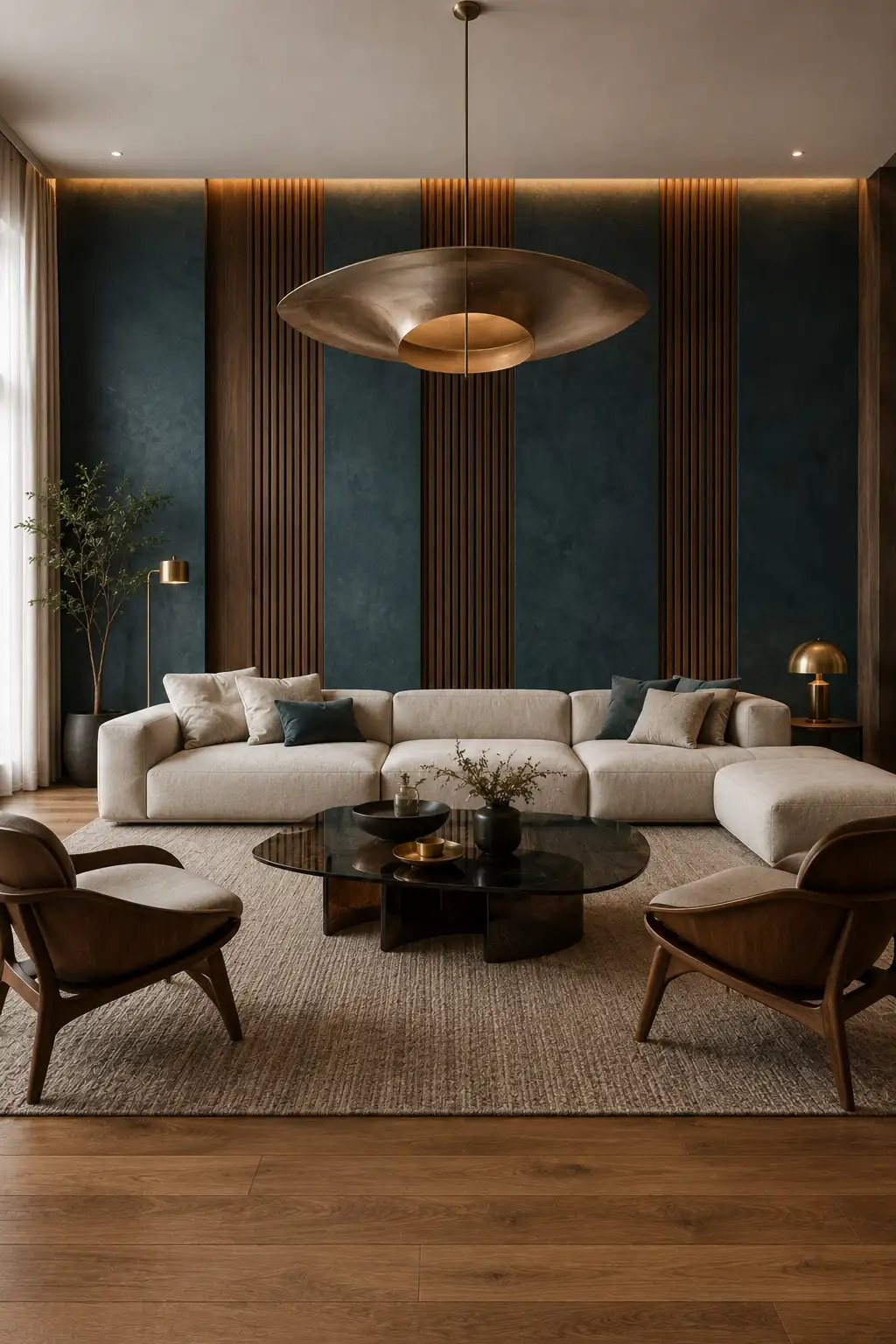
Slate blue offers a more understated way to bring depth and sophistication to an accent wall. Its muted blue-gray character feels refined rather than overly colorful, making it a strong option for modern living rooms. Used across a large feature wall, the shade creates a calm backdrop while still giving the room plenty of visual character.
The color pairs especially well with ivory upholstery, walnut wood, black accents, and brushed bronze or brass lighting. Vertical walnut slats can add warmth and rhythm to the wall, while the slate blue panels keep the overall look sophisticated. A large sculptural pendant can then introduce a statement element without taking attention away from the wall.
Slate blue also works beautifully with both natural and artificial light. Daylight can reveal its softer blue undertones, while warm evening lighting gives the color a deeper and moodier appearance. To keep the room feeling balanced, use light upholstery and a neutral rug, then repeat small touches of blue through cushions or accessories.
Pro Tip: Combine slate blue with ivory, walnut, and warm bronze lighting to create a contemporary accent wall that feels elegant, calm, and designer-inspired.
11. Deep Burgundy for a Rich and Dramatic Living Room
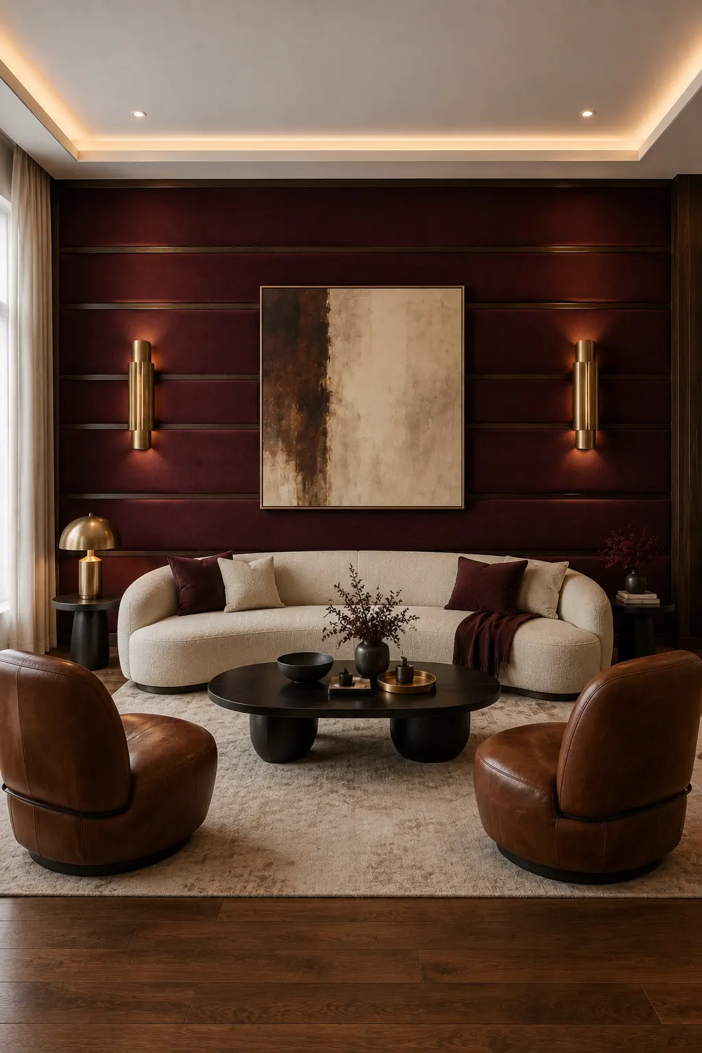
Deep burgundy brings a sense of warmth and drama that can make a living room feel remarkably sophisticated. Its wine-inspired depth creates a strong backdrop for neutral furniture while adding more personality than standard brown or gray. When used across a full accent wall, the shade gives the room an intimate, luxurious character that works particularly well in evening settings.
The richness of burgundy looks beautiful with ivory upholstery, cognac leather, dark walnut, and brushed brass. Horizontal architectural detailing, as shown here, adds subtle structure to the wall while keeping the overall design clean and contemporary. A large neutral artwork can break up the dark surface, while brass sconces introduce warm highlights without overwhelming the color.
Because burgundy is naturally intense, balance it with lighter fabrics and restrained accessories. Cream seating and a neutral rug help keep the room visually comfortable, while small burgundy accents in cushions or throws can connect the wall to the rest of the space. Warm layered lighting will also bring out the deeper red and brown undertones after sunset.
Pro Tip: Balance deep burgundy with ivory, cognac leather, dark wood, and warm brass to create a dramatic living room that feels rich without becoming too heavy.
12. Deep Navy for a Sophisticated and Focused Home Office
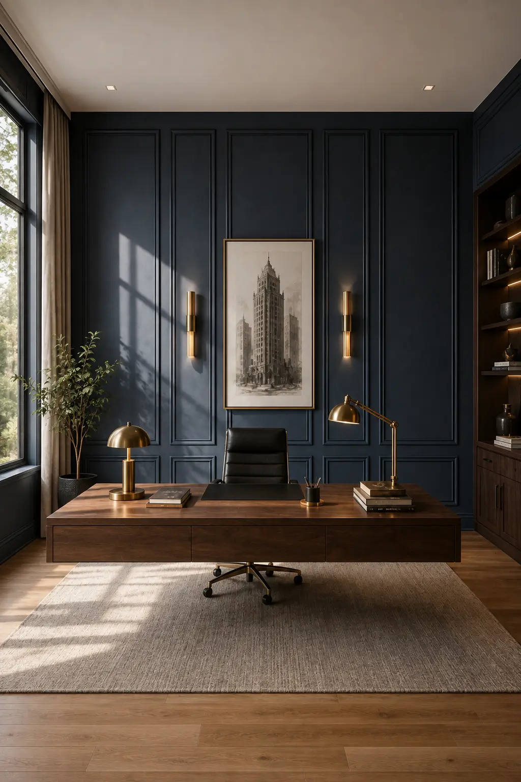
Deep navy can give a home office an instant sense of authority and refinement. The color creates a strong architectural backdrop while making lighter artwork, warm wood, and metallic details stand out beautifully. Used across a paneled feature wall, it gives the workspace a tailored appearance that feels more like a private study in a luxury residence.
Warm walnut furniture is an especially strong match for this shade because the wood introduces natural warmth against the cool depth of navy. Brass desk lamps, picture lights, and small decorative accents add subtle contrast without making the room feel flashy. The combination of dark wall panels, rich wood, and neutral flooring creates a balanced setting that feels both sophisticated and comfortable.
Natural daylight is also important when using such a deep color in a workspace. A large window can soften the navy during the day, while warm task lighting keeps the room inviting in the evening. Keep the desk styling clean and intentional so the architectural wall remains the main feature rather than competing with too many accessories.
Pro Tip: Pair deep navy with walnut furniture, warm brass lighting, and neutral textiles to create a home office that feels polished, focused, and genuinely high-end.
13. Sophisticated Greige for a Calm and Expensive Modern Look
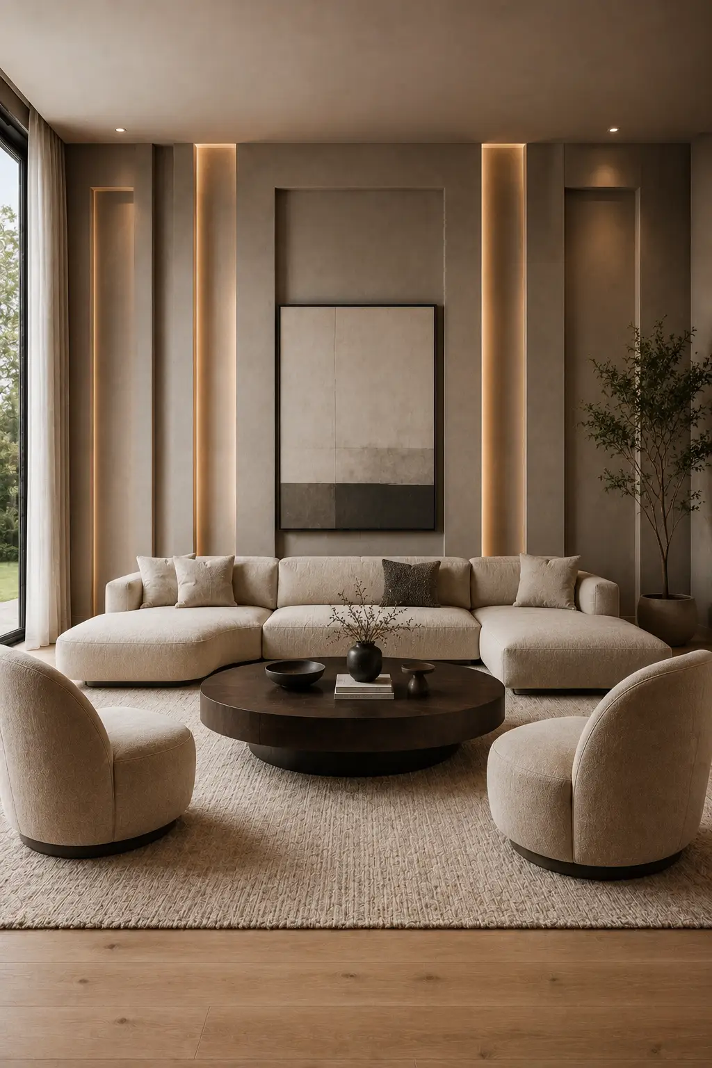
Sophisticated greige is an excellent choice when you want an accent wall to feel refined without relying on dramatic jewel tones. Sitting between warm gray and beige, this shade creates a soft architectural backdrop that feels polished, modern, and easy to live with. Its subtle depth works especially well in spacious living rooms where natural light can bring out its warmer undertones.
The beauty of greige is how effortlessly it works with layered neutrals and natural materials. Cream upholstery, dark walnut furniture, black accents, and warm brushed-metal lighting all complement the color without creating harsh contrast. In this design, the recessed wall sections and concealed lighting add dimension, turning a relatively quiet color into a sophisticated architectural feature.
Greige also gives you plenty of freedom when styling the rest of the room. You can keep the palette tonal with ivory, taupe, and beige, or introduce darker brown and black details for more definition. Soft ambient lighting is particularly effective because it highlights the subtle texture and recessed areas while keeping the overall room warm and inviting.
Pro Tip: Choose a warm greige with subtle brown undertones and pair it with ivory upholstery, dark wood, and concealed warm lighting for a polished modern interior.
14. Burnished Bronze for a Striking Luxury Statement
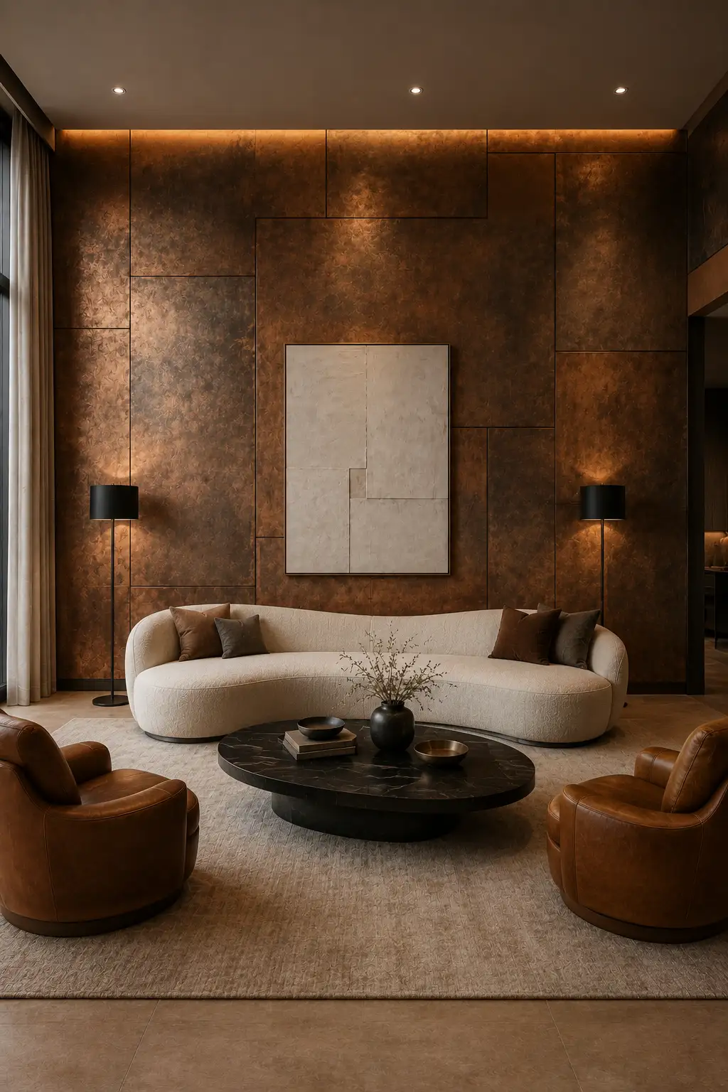
Burnished bronze is the boldest choice in this collection, bringing warmth, depth, and a distinctly luxurious character to an accent wall. Its softly metallic surface catches light in different ways throughout the day, creating subtle shifts between bronze, copper, and deep brown. Instead of looking flashy, a carefully balanced finish can give a living room the atmosphere of an upscale private lounge.
This finish works beautifully with cream upholstery, caramel leather, dark wood, and black accents. Large architectural panels can make the metallic surface feel more intentional, while warm concealed lighting highlights its natural variation and gives the wall even more depth. A neutral sofa and restrained artwork keep the composition balanced while allowing the bronze wall to remain the main attraction.
The key to using a metallic wall successfully is choosing a finish with depth rather than a highly reflective surface. A brushed, burnished, or hand-finished effect tends to look more sophisticated because it creates subtle tonal movement instead of appearing glossy. Keep the surrounding palette warm and understated, then let carefully chosen lighting bring out the richer copper and bronze undertones.
Pro Tip: Choose a muted burnished bronze finish rather than a highly shiny metallic paint, then pair it with cream, caramel leather, dark wood, and warm lighting for a truly luxurious result.
Choosing the Right Accent Wall Color for Your Home
The best accent wall color isn’t necessarily the darkest or boldest shade. It should work with the room’s natural light, furniture, flooring, and existing finishes while creating enough contrast to feel intentional. Deep jewel tones can bring drama, warm neutrals can create quiet luxury, and richer earthy shades can make a room feel inviting and sophisticated.
Before committing to a color, test a sample at different times of day and look at it beside your main furniture and lighting. A shade that feels perfect in bright daylight can look completely different at night. When the color, architectural details, materials, and lighting all work together, even one accent wall can give an ordinary room the polished feeling of a professionally designed interior.