

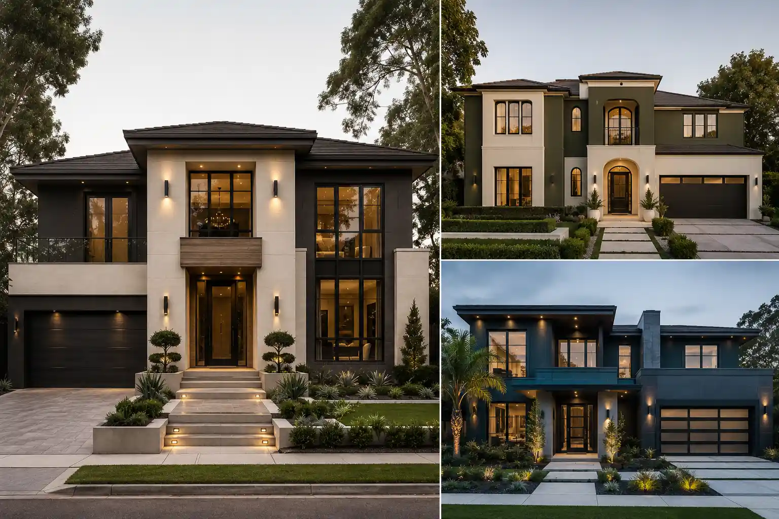
Table of Contents
Choosing an exterior paint color can completely change how a home feels from the street. In 2026, luxury exteriors are moving toward sophisticated shades that feel warm, architectural, and timeless rather than overly bold or predictable.
From refined greige and soft ivory to deep olive, charcoal, and blue green, today’s most appealing palettes add depth without overwhelming the architecture. The right combination can also highlight windows, entrances, rooflines, and other important exterior details.
Whether you’re refreshing an existing facade or planning a completely new look, these color ideas offer plenty of inspiration. Each palette brings a polished character to the home while keeping the overall exterior modern and upscale.
The Outdoor Paint Colors Palettes Setting the Tone in 2026
The 14 ideas below explore different ways to create a luxury exterior using carefully balanced paint colors. Some combinations are understated and timeless, while others use deeper shades to create a stronger architectural statement. Together, they show how thoughtful color choices can make a modern home feel more distinctive, sophisticated, and expensive.
1. Warm Greige Creates a Sophisticated Modern Exterior
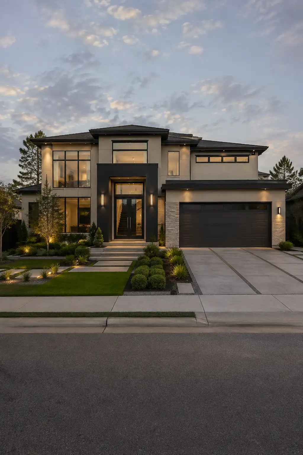
Warm greige gives a luxury home a polished appearance by balancing the softness of beige with the refined character of gray. It works especially well on large contemporary facades where you want the exterior to feel warm, elegant, and architectural without looking too traditional.
In this look, the warm greige walls are paired with deep charcoal around the entrance, garage, roofline, and selected architectural sections. Black-framed windows add crisp contrast, while the warm interior lighting and carefully structured landscaping make the entire facade feel more inviting after sunset.
This palette is particularly effective for modern two-story homes with large windows and strong geometric lines. The neutral base also gives you plenty of flexibility with landscaping, exterior lighting, doors, and other architectural details without making the overall design feel busy.
Pro Tip: Choose a greige with subtle warm undertones and test it on several areas of the exterior before committing. The surrounding landscaping and changing daylight can make the same paint appear noticeably different throughout the day.
2. Deep Olive Green Brings Depth to Contemporary Facades
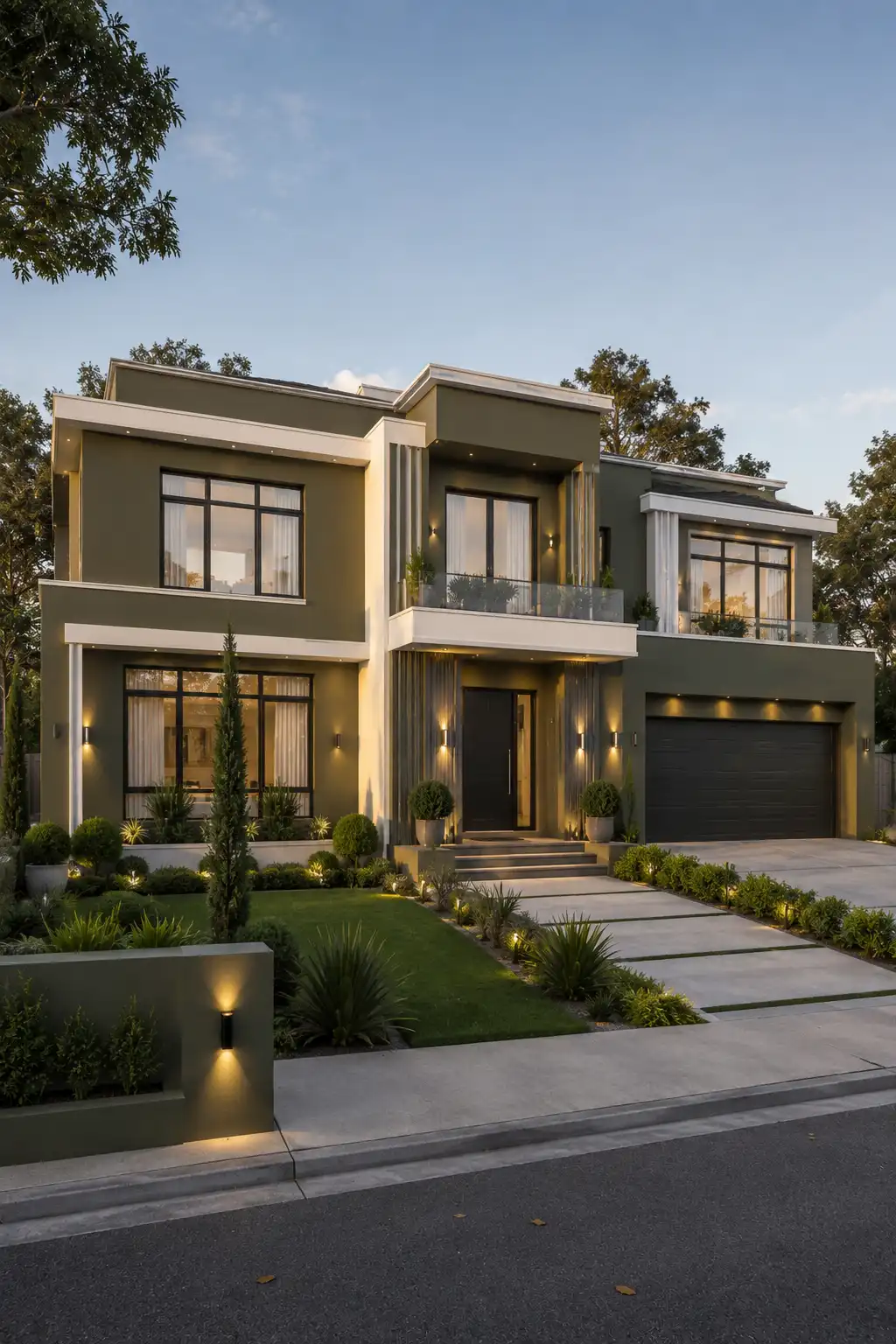
Deep olive green creates a striking exterior without feeling overly dramatic or harsh. Its muted character works beautifully on contemporary homes, especially when the architecture has clean lines, large windows, and strong geometric forms.
The color looks especially sophisticated when paired with warm ivory or soft cream trim. In this design, black-framed windows and a dark entrance add crisp contrast, while the lighter architectural edges keep the deep green from making the facade feel too heavy.
This palette is also a great choice for homes surrounded by mature trees and carefully planned landscaping. The muted green connects naturally with the outdoor setting while still giving the house a polished, distinctly modern identity that stands apart from standard gray or beige exteriors.
Pro Tip: Choose an olive shade with gray or muted undertones rather than a bright green. It’ll look more refined in strong sunlight and pair much better with black, cream, and bronze architectural details.
3. Charcoal and Warm White Create a Bold Architectural Contrast
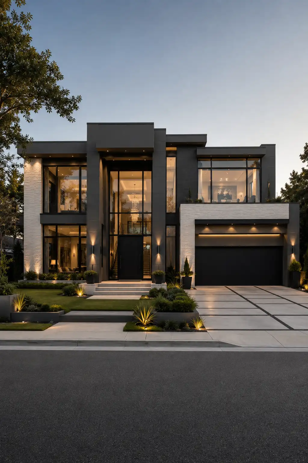
A charcoal exterior brings instant depth and presence to a contemporary home. Rather than making the facade feel dark or closed in, the right charcoal shade can emphasize clean architectural lines and give large windows a much stronger visual impact.
Pairing charcoal with warm white creates a balanced contrast that keeps the exterior from becoming too monochromatic. In this look, the lighter sections around the garage and upper facade soften the darker walls, while black-framed glass, a matching entrance, and warm exterior lighting reinforce the modern character.
This palette works especially well on larger homes with dramatic entrances, generous glazing, and layered architectural volumes. During the evening, warm interior light against the charcoal facade creates an especially sophisticated appearance, making the home’s geometry stand out beautifully from the street.
Pro Tip: Use charcoal on the strongest architectural volumes rather than every exterior surface. Introducing warm white on selected sections will give the facade more dimension and prevent the darker color from visually overwhelming the home.
4. Soft Ivory Makes a Luxury Exterior Feel Timeless
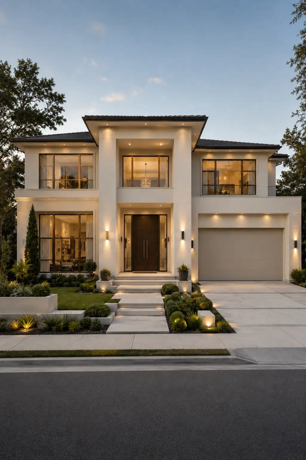
Soft ivory brings a clean, elegant quality to a luxury exterior while avoiding the stark appearance that can come with pure white paint. It reflects natural light beautifully and helps architectural details feel crisp without making the home look cold or overly minimalist.
The palette becomes even more sophisticated when ivory walls are combined with dark bronze or black-framed windows, a rich wood entrance, and subtle warm lighting. These darker accents create enough contrast to define the facade while allowing the lighter exterior to remain the dominant visual feature.
This approach works particularly well on large contemporary homes with symmetrical proportions, generous windows, and a prominent entrance. It also gives landscaping plenty of room to stand out, making greenery, pathways, and architectural lighting feel like intentional parts of the overall exterior design.
Pro Tip: Avoid a blue-based white if you want this warm luxury effect. A soft ivory with gentle cream undertones will usually look more inviting and expensive across different types of natural light.
5. Taupe and Charcoal Give Modern Homes Subtle Depth
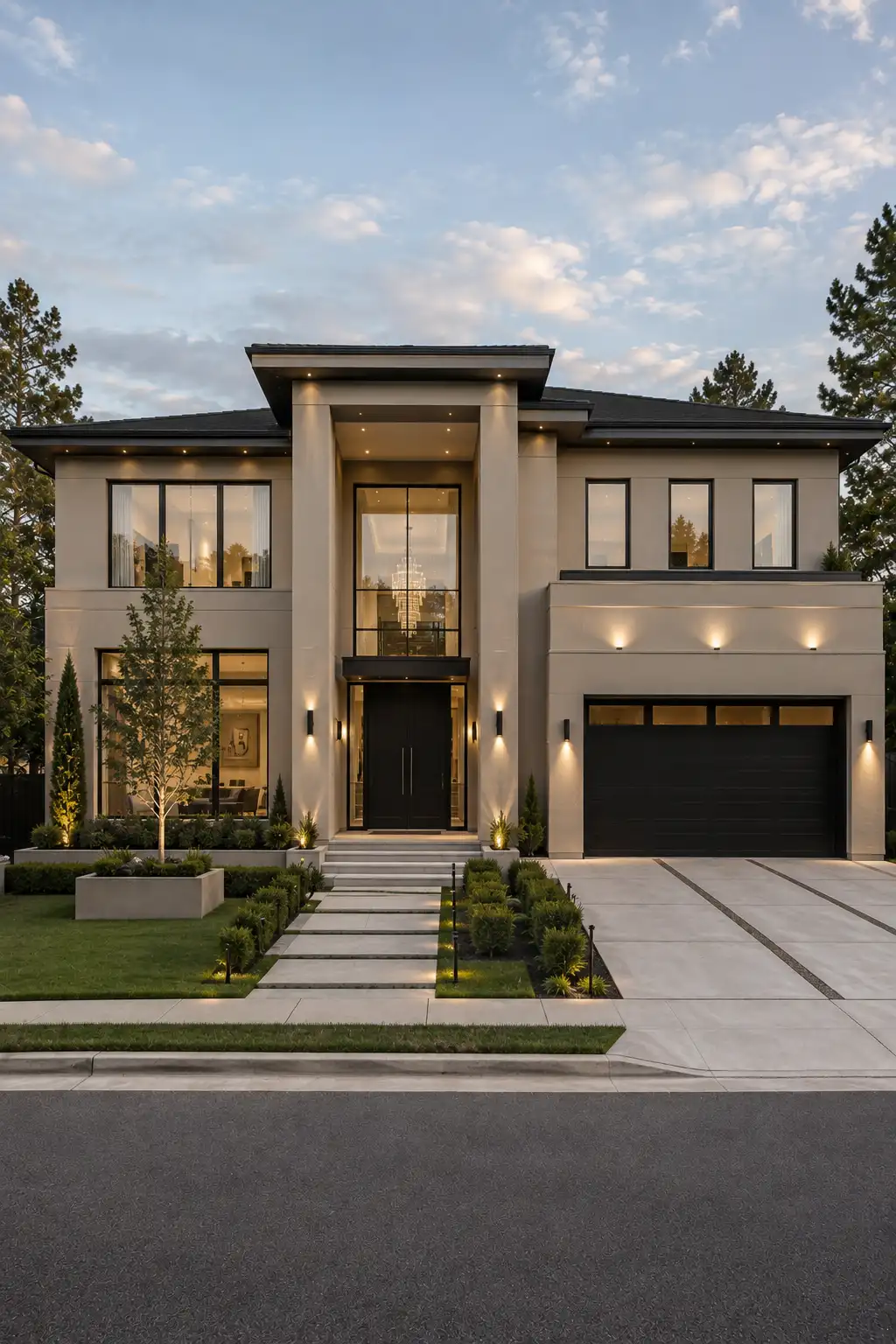
Taupe is a strong choice when you want an exterior that feels warmer than gray but more refined than traditional beige. Its understated tone creates a sophisticated foundation that works particularly well with clean contemporary architecture and expansive glass.
Pairing taupe with charcoal adds definition without relying on overly dramatic contrast. The darker shade works beautifully around garage doors, window frames, rooflines, and entry details, while carefully placed warm lighting brings out the softer undertones of the main facade.
This combination is especially effective on large two-story homes where different architectural volumes can be emphasized through subtle color changes. With manicured landscaping and simple concrete paths, the result feels polished, current, and effortlessly upscale.
Pro Tip: Look for a taupe that has balanced gray and warm beige undertones. Before choosing the final shade, view large paint samples in both direct sunlight and evening light to make sure it maintains the right warmth.
6. Warm White and Bronze Deliver Quiet Luxury Outdoors
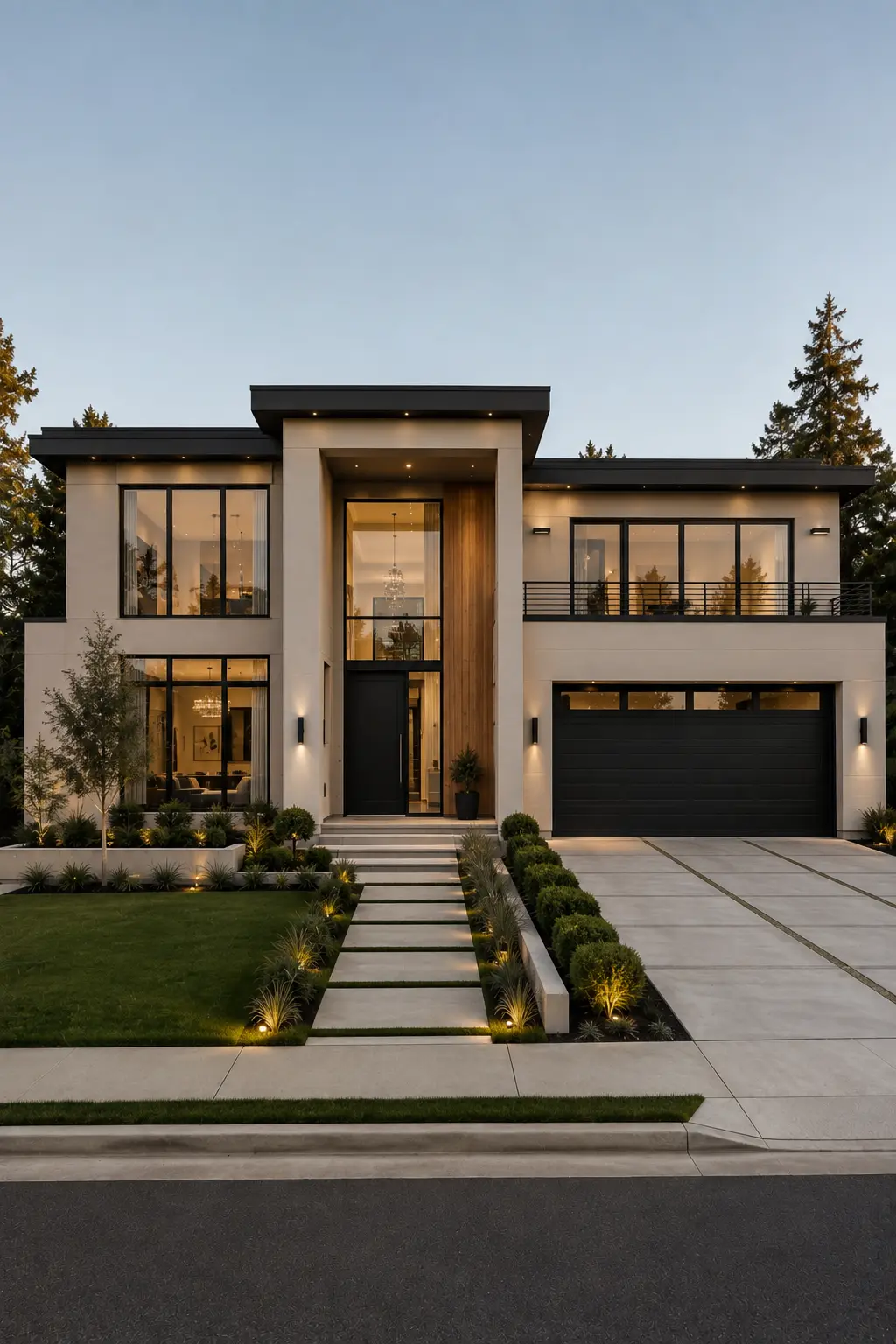
Warm white paired with dark bronze creates a refined exterior that feels luxurious without relying on dramatic color contrasts. The softer white keeps the architecture bright and elegant, while bronze details introduce just enough depth around the windows, entrance, lighting, and other key features.
This palette works beautifully with contemporary homes that feature large expanses of glass and clean horizontal rooflines. The warm facade also complements natural wood accents, dark roofing, and carefully positioned greenery without pushing the design toward a rustic look.
What makes this combination particularly appealing is its versatility. It can look crisp and fresh during the day, then become much more atmospheric in the evening as warm architectural lighting highlights the entrance and facade. The result is understated, polished, and distinctly upscale.
Pro Tip: Choose a warm white rather than a bright, cool white, and use bronze selectively. Keeping the metal accents consistent across lighting, doors, and window details will make the exterior feel much more cohesive.
Also Read: 15 Small Home Office Ideas That Instantly Boost Focus
7. Deep Blue Green Adds Character Without Overpowering the Facade
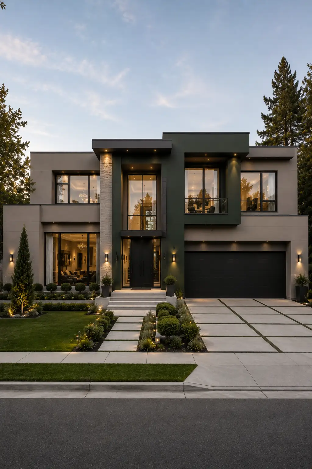
Deep blue green is an excellent choice when you want a modern exterior to feel distinctive without relying on a conventional navy or charcoal palette. Its muted quality gives the facade depth, while the subtle green undertone keeps the color connected to the surrounding landscape.
Using the shade on a central architectural volume creates a strong focal point without overwhelming the entire home. Softer taupe or warm gray sections balance the darker color, while black-framed windows and a dark entrance reinforce the clean contemporary lines.
This palette is especially effective on homes with asymmetrical architecture, large glass panels, and layered facade volumes. As natural light changes throughout the day, the blue and green undertones shift subtly, giving the exterior a richer appearance than a flat neutral paint color.
Pro Tip: Choose a blue green with muted gray undertones instead of a bright teal. Test it against your home’s existing roof, paving, and landscaping to make sure the color stays sophisticated in both sunlight and shade.
8. Warm Ivory and Black Frame a Clean Contemporary Facade
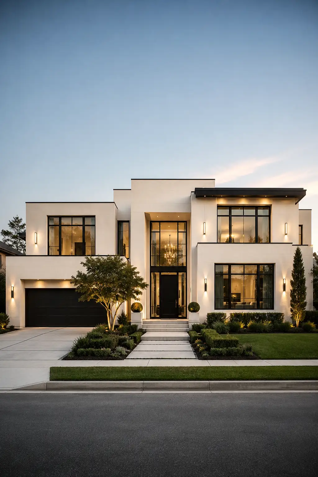
Warm ivory creates a bright, sophisticated exterior while keeping the architecture soft and welcoming. Unlike stark white, this slightly warmer shade adds depth to large wall surfaces and works beautifully with modern homes that rely on strong geometry and expansive glass.
Black-framed windows provide the contrast that makes this palette feel distinctly contemporary. The dark garage door, entrance, roofline details, and slim exterior lighting reinforce the architecture without competing with the ivory facade, creating a crisp and carefully balanced appearance.
This combination is particularly effective when paired with structured landscaping and simple concrete pathways. The neutral facade lets greenery add natural color while warm interior lighting brings another layer of elegance after sunset, giving the home a polished look from morning through evening.
Pro Tip: If your home gets strong afternoon sun, choose a slightly creamy ivory instead of a bright white. It’ll soften the glare and maintain a richer appearance throughout the day.
9. Taupe and Espresso Brown Create a Richer Modern Palette
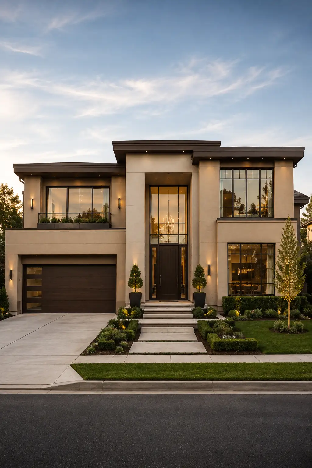
A warm taupe exterior can make a contemporary home feel noticeably more refined without pushing the design into overly traditional territory. Its subtle beige and gray balance gives large facades a soft, sophisticated character while allowing architectural details to remain the focus.
Deep espresso brown adds richness to the palette, particularly around the roofline, garage, entrance, and other architectural accents. Combined with expansive black-framed windows, the darker elements create a strong visual structure while the taupe keeps the overall facade light and welcoming.
This combination is especially appealing on luxury homes with broad horizontal rooflines, tall entrances, and carefully framed landscaping. The warmer palette also works beautifully with evening illumination, allowing the facade to shift from understated during the day to dramatic and inviting after dark.
Pro Tip: Keep espresso brown limited to architectural accents rather than using it across large wall areas. This preserves the sophisticated contrast and prevents the exterior from feeling visually heavy.
10. Deep Navy Brings Sophisticated Drama to Modern Exteriors
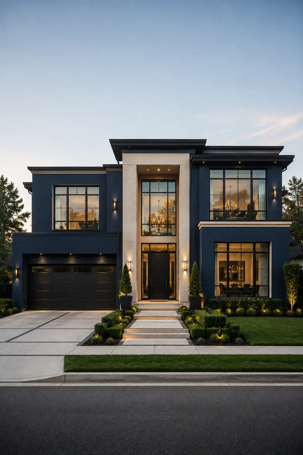
Deep navy gives a luxury home a confident, dramatic character while remaining far more refined than brighter exterior blues. Its rich tone creates a strong architectural backdrop, especially when used across clean geometric volumes with generous windows and carefully defined rooflines.
Warm ivory around the entrance provides an elegant counterpoint to the darker facade, keeping the overall composition balanced. Black-framed windows, a matching garage door, and warm interior lighting reinforce the navy without introducing unnecessary colors or decorative elements.
This palette works particularly well for larger contemporary homes where you want the exterior to make a memorable first impression. Against green landscaping and a soft evening sky, the navy facade feels sophisticated, tailored, and distinctly modern.
Pro Tip: Choose a navy with muted or slightly gray undertones rather than a bright blue. It’ll look richer in natural light and pair more naturally with warm white, black, bronze, and modern landscaping.
11. Blue Green and Charcoal Create a Refined Statement Exterior
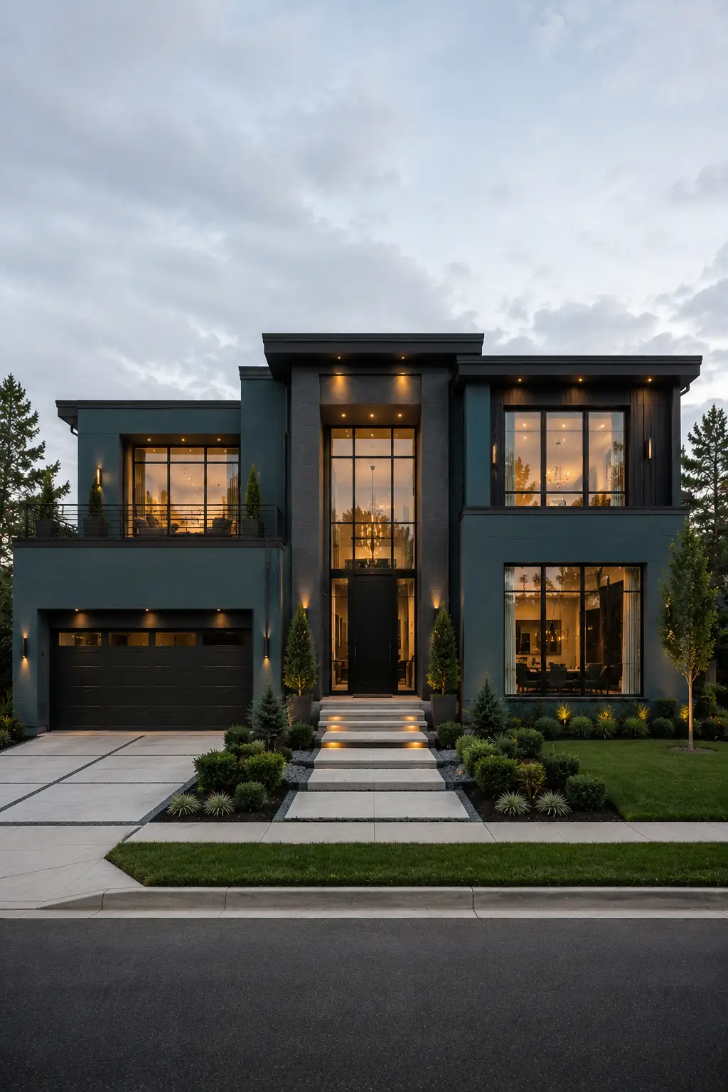
A deep blue green exterior offers a sophisticated alternative to the more familiar navy, gray, and black palettes. Its subtle green undertones give the facade a richer appearance, while the darker value creates a strong connection between the home and its surrounding landscaping.
Charcoal architectural sections add another layer of depth, particularly around the entrance, roofline, and garage. The combination works beautifully with expansive black-framed windows because the darker elements visually connect the different parts of the facade without making the design feel overly complicated.
This palette is ideal for contemporary homes with bold geometric volumes and large areas of glass. Under soft daylight, the blue green feels calm and sophisticated, while warm interior and exterior lighting in the evening brings out its deeper tones and gives the residence a dramatic, upscale presence.
Pro Tip: Look for a blue green that leans slightly toward charcoal rather than a saturated teal. A muted shade will feel more architectural and remain easier to coordinate with black, gray, cream, and natural landscaping.
12. Black and Cream Create a Dramatic Luxury Exterior
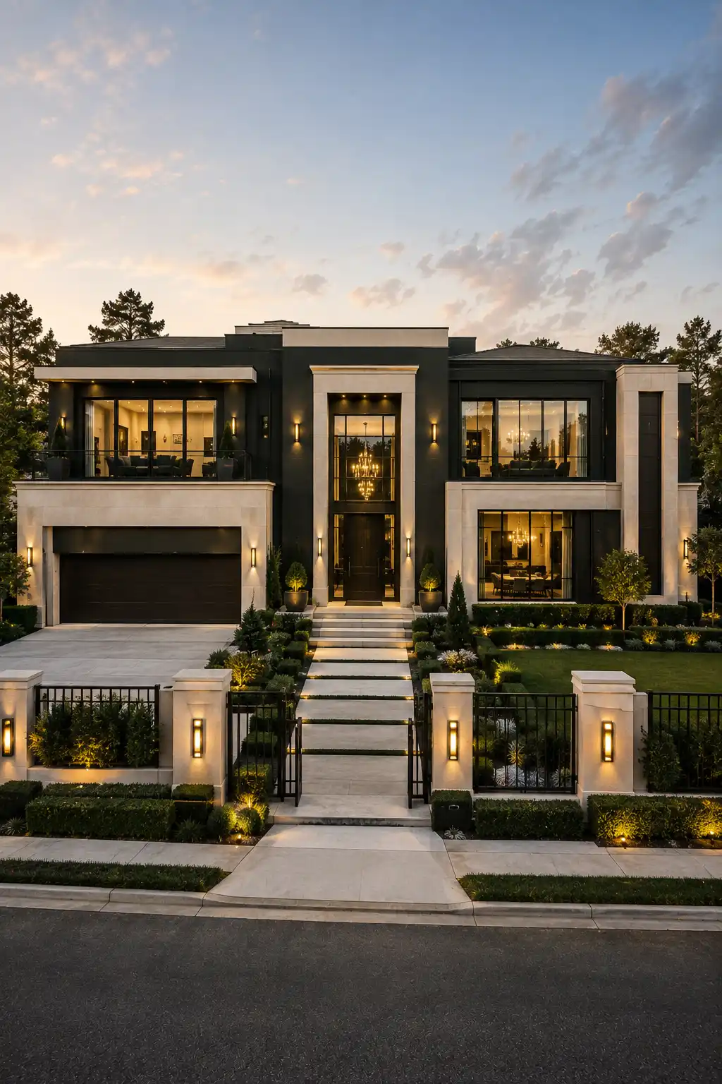
Black and cream create one of the strongest contrasts for a modern luxury exterior, giving the home a confident and highly architectural appearance. The combination feels bold without becoming overly complicated because both shades are clean, timeless, and easy to balance.
Using deep black across the main architectural volumes makes the lighter cream sections around the entrance, garage, and upper facade stand out beautifully. Large glass windows, warm interior lighting, and subtle bronze or brass accents add warmth to the darker palette without taking away from its contemporary character.
This approach works especially well on larger homes with layered geometric forms and a prominent central entrance. Carefully structured landscaping can soften the contrast, while warm exterior lighting highlights the facade after sunset and gives the entire property an elegant, almost boutique-hotel quality.
Pro Tip: Don’t use pure black everywhere. A very dark charcoal or softened black often gives the exterior more depth and looks less harsh when exposed to strong sunlight.
13. Muted Sage Green Adds Sophistication to Modern Homes
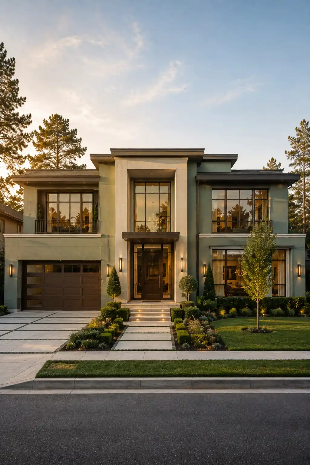
Muted sage green brings a softer, more sophisticated character to a contemporary exterior without making the home feel overly colorful. Its gray undertones keep the shade refined, while the subtle green works beautifully with surrounding trees, lawns, and structured landscaping.
For a luxury finish, pair sage with warm cream or ivory architectural sections and dark bronze or charcoal accents. Black-framed windows can add a crisp modern edge, while a rich wood or dark entrance door gives the facade a focal point without making the palette feel rustic.
This color combination is especially effective on modern homes with broad horizontal lines, large glass openings, and layered facade volumes. The muted green changes gently with natural light, creating a more dimensional appearance throughout the day while maintaining a calm, upscale presence.
Pro Tip: Avoid overly yellow or saturated sage shades. A muted sage with noticeable gray undertones will look more sophisticated and coordinate more easily with cream, charcoal, bronze, and contemporary landscaping.
14. Warm Sandstone and Terracotta Add Refined Character
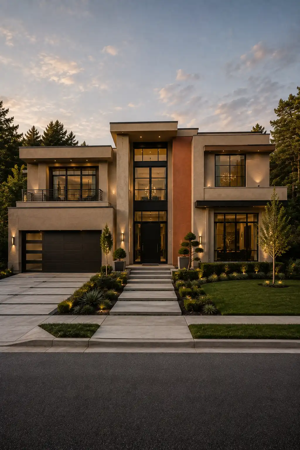
Warm sandstone beige creates a sophisticated foundation for a contemporary exterior, giving the facade enough warmth to feel inviting while maintaining a clean architectural appearance. Its neutral character works particularly well with large modern windows, flat rooflines, and strong geometric forms.
A restrained terracotta accent can make this palette much more distinctive without turning the home rustic or overly Mediterranean. Used on a single architectural volume, the muted terracotta adds warmth and visual interest, while black-framed windows and dark roofing keep the overall composition firmly modern.
This combination is especially effective when the terracotta is treated as a supporting color rather than the main exterior shade. Against structured greenery and warm evening lighting, the sandstone facade feels elegant and balanced, while the subtle accent gives the home a memorable focal point.
Pro Tip: Keep terracotta muted and use it on one defined architectural section. Avoid bright orange or heavily red tones, which can make the exterior feel dated rather than refined.
Final Thoughts on Choosing a Luxury Exterior Color
The best luxury exterior color isn’t necessarily the boldest one. In 2026, sophisticated homes are leaning toward layered neutrals, muted greens, deep blue greens, warm whites, and carefully controlled dark accents. These palettes give modern architecture enough depth while keeping the overall facade polished and timeless.
Before committing to a color, consider the home’s architecture, natural light, roof color, window frames, driveway, and surrounding landscaping. Test large samples on the actual exterior and view them at different times of day. A carefully balanced palette can transform the entire character of a home and give the facade the refined, high-end appearance you’re after.